The Science Behind Color Perception and Human Eye Limitations
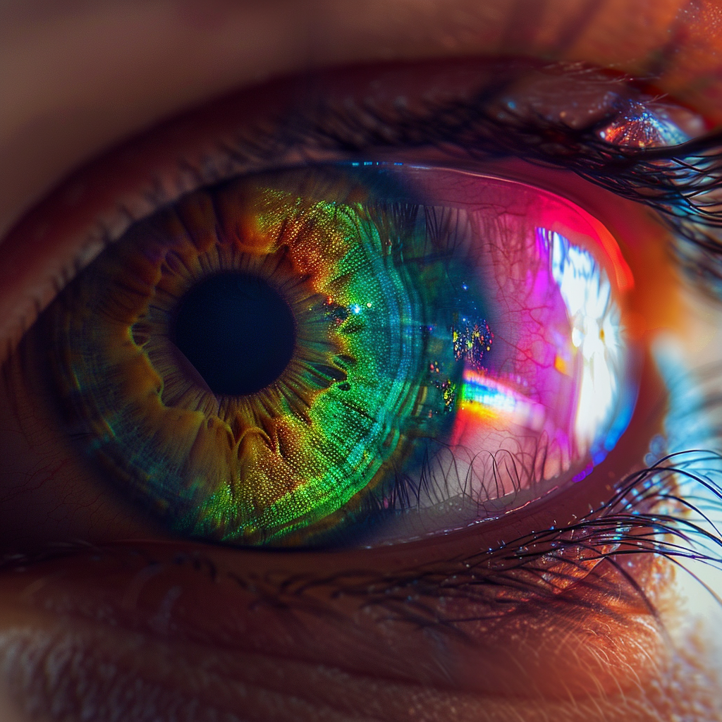
Color is a fundamental aspect of our daily lives, influencing emotions, decisions, and experiences. At Bee Techy, we are continually fascinated by how color perception plays a critical role in software development and user experience. According to the New York Times, “A New Look at How Many Colors the Human Eye Can See” reveals that the human eye can distinguish up to 10 million colors, a significant increase from previous estimates. This breakthrough understanding pushes us to consider how we can leverage this vast palette in our digital creations.
The human eye is a marvel, yet it has its limitations. While we can perceive an impressive spectrum of colors, certain conditions and lighting can alter how we interpret these hues. As developers and designers, we must account for these variables to ensure our work resonates with users as intended.
The implications of these findings are vast. From the way we design user interfaces to the color choices we make for branding, our enhanced understanding of color perception can lead to more impactful and accessible digital experiences.
Advancements in Color Perception Technology 2024: Pushing the Human Eye Color Range
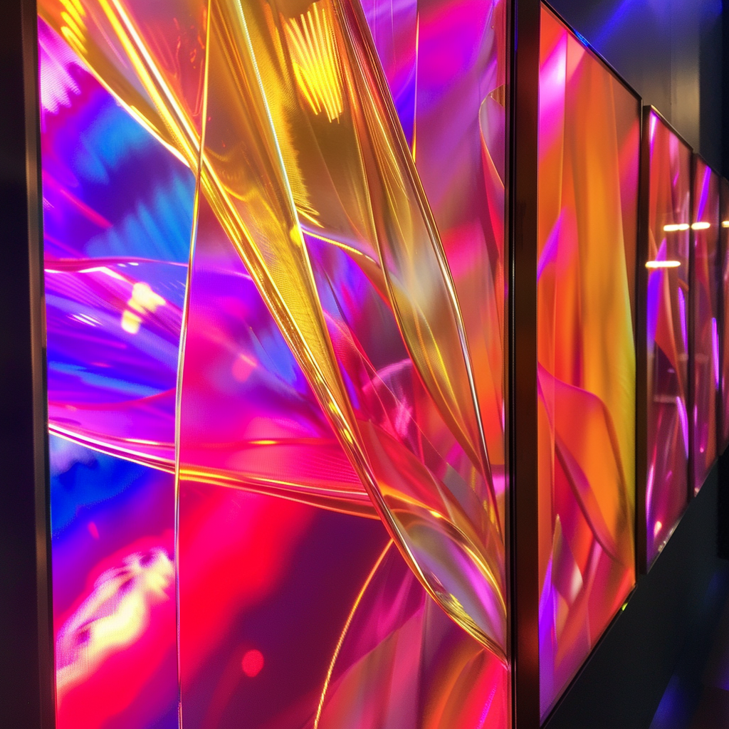
The year 2024 marks a pivotal moment for color perception technology. Innovations in display technologies are revolutionizing the way we interact with our devices. BBC News reports, “Advancements in Display Technologies Match Human Eye’s Color Perception,” highlighting that new screens are designed to mirror the human eye’s ability to perceive colors. This development promises a more authentic and vibrant visual experience for users.
These advancements are not just about aesthetics; they have practical applications that enhance clarity, detail, and realism. For instance, medical imaging and simulation training now benefit from displays that can replicate subtle variations in color that the human eye can detect, leading to better outcomes and more accurate diagnoses.
At Bee Techy, we are excited to incorporate these cutting-edge display technologies into our projects, ensuring that our clients’ applications are at the forefront of visual innovation.
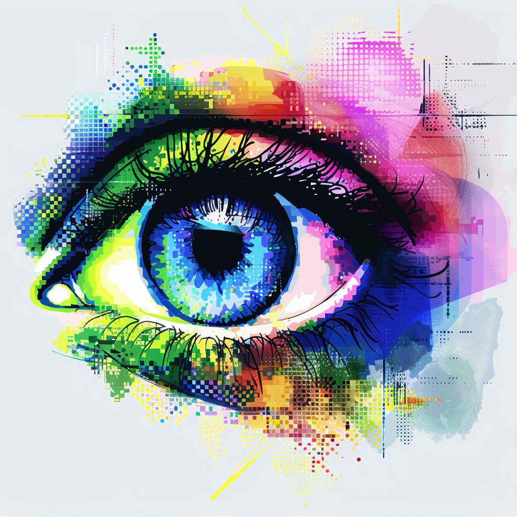
UX Design Color Trends Los Angeles: Embracing the Full Spectrum in Digital Interfaces
Los Angeles is a hub for creativity and innovation, and this extends to the realm of UX design. The latest trend highlighted by Wired is how artists and designers are using a deeper understanding of color perception to create immersive experiences that captivate audiences. These insights are invaluable for UX designers who aim to create interfaces that are not only functional but also emotionally resonant.
“UX design color trends Los Angeles” is more than a buzzword; it’s a reflection of the city’s vibrant culture and the tech industry’s push towards more personalized and engaging digital experiences. By embracing the full spectrum of colors, designers can craft interfaces that are intuitive, accessible, and memorable.
As a leading software development agency in Los Angeles, Bee Techy is at the forefront of these trends, ensuring that our clients’ products stand out in a competitive market.
Color Accessibility in Digital Interfaces: Strides Toward Inclusivity
Accessibility is a cornerstone of good design, and color accessibility is no exception. Scientific American notes, “Color Accessibility Improvements for Color Vision Deficiencies,” that designers are now leveraging the full spectrum to create inclusive digital interfaces. This approach is crucial for addressing the needs of individuals with color vision deficiencies, which affect approximately 1 in 12 men and 1 in 200 women globally.
The focus on “color accessibility digital interfaces” means that more users can enjoy a seamless and barrier-free digital experience. By using contrasting colors, patterns, and text labels, designers can ensure that information is conveyed effectively to all users, regardless of their color perception abilities.
At Bee Techy, we prioritize accessibility in all our projects, understanding that an inclusive digital world is not only ethical but also beneficial for our clients by reaching a wider audience.
Color Therapy Wellness Apps: Harnessing the Power of Hue for Better Health
The intersection of technology and wellness has given rise to “color therapy wellness apps,” a field that harnesses the power of color to promote mental and emotional well-being. The Guardian’s recent article explores how understanding color perception leads to better outcomes in wellness applications. These apps offer personalized experiences that can help users reduce stress, improve mood, and even enhance sleep quality.
The science behind color therapy is rooted in how different hues can elicit specific psychological responses. For example, blue tones are often associated with calmness and serenity, while warmer colors like red and orange can stimulate energy and alertness.
Bee Techy is passionate about integrating these insights into the development of wellness apps, contributing to the overall health and happiness of users around the world.
Ready to incorporate the latest in color perception and design into your next project? Visit us at Bee Techy to get a quote and let’s create something vibrant and inclusive together.